VR Language Learning is a VR application that uses the latest generative AI language models (particularly ChatGPT) to enable users to practice oral conversations in a more flexible way. As a product designer, my role was to build an interactive interface for the application using Unity 3D.
This is my first project working with Virtual Reality and Unity 3D. This case study delves into the process of designing a screen interface for VR by converting 2D design from Figma into Unity.
Research
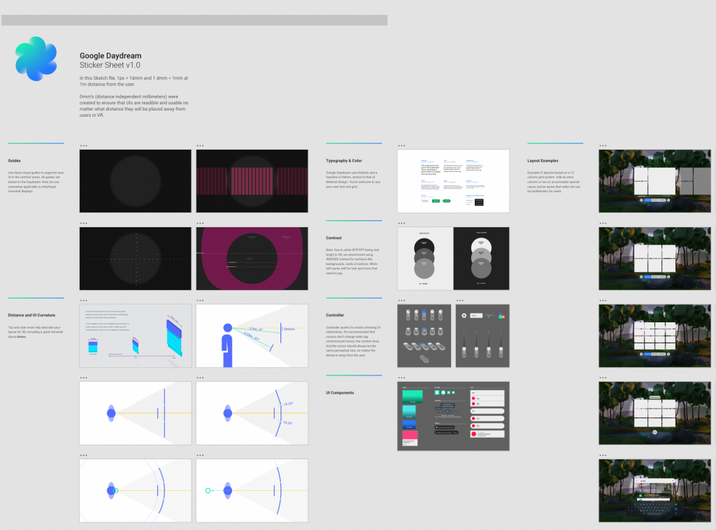
Google Daydream Stickersheet
Google VR Sticker sheet was introduced during Google I/O ’17 as a part of the guidelines on how to design screen interfaces for VR. This Sketch file offers a variety of VR UI components and serves as a valuable resource for comprehending spatial relationships, distances, and sizes within virtual reality, allows us to scale the UI from Figma or Sketch to other game engines.
Oculus Developer
Oculus PWA Foundational Elements and Oculus’s resource website provides guidelines on how to design foundation 2D elements for VR headset, such as fonts, colors, buttons, hit size, etc.
Other resources
Other resources I found that was useful during the process:
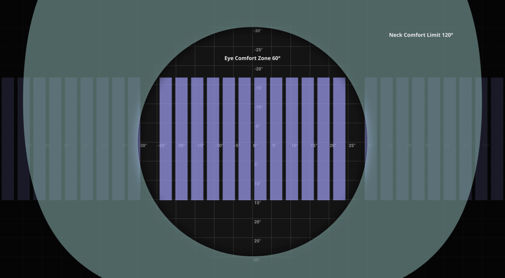
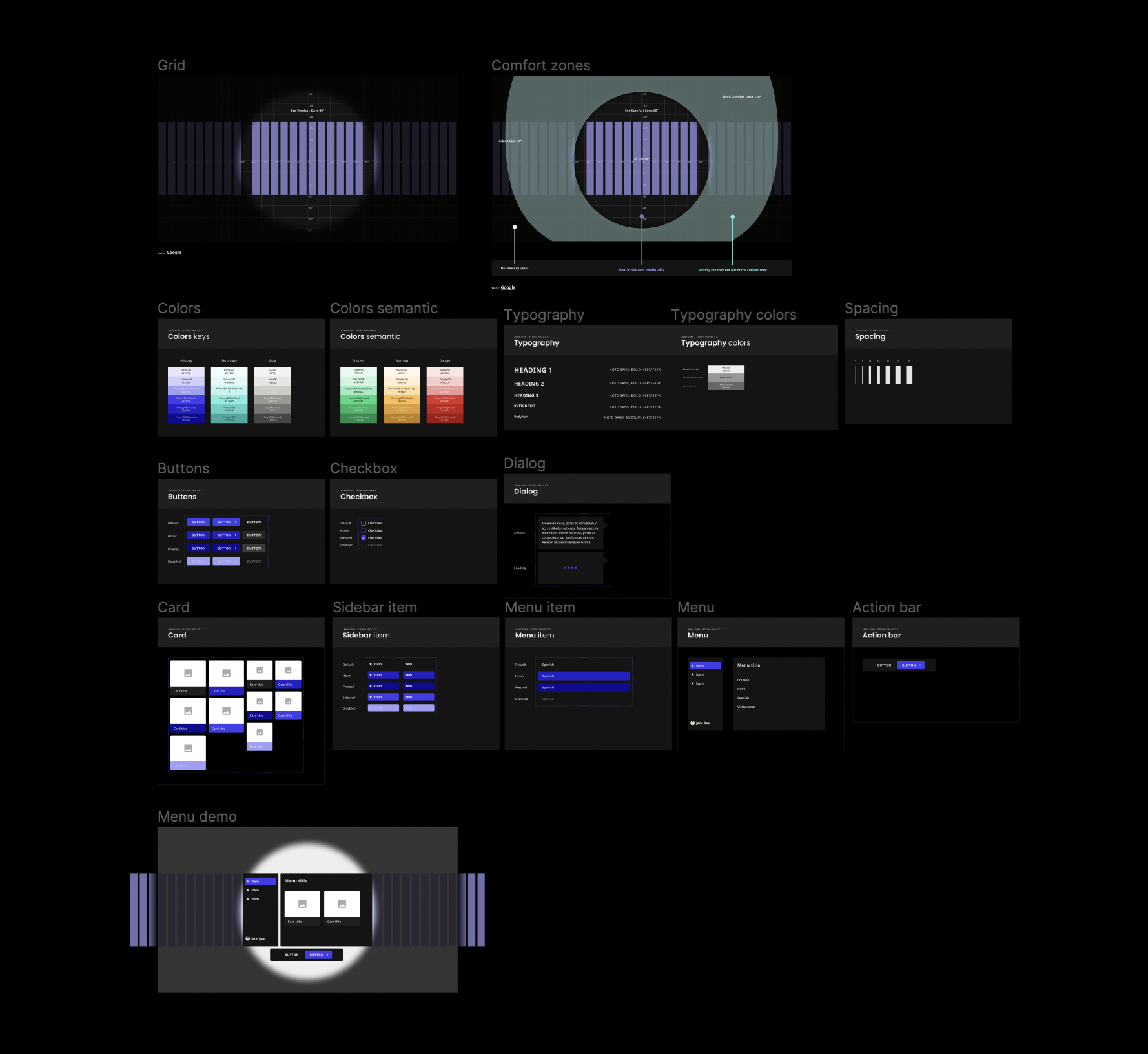
This grid guideline taken from Google VR Sticker sheet can be used on either frame size 1920x1080px or 2304x1296px as the 2 most common VR screen resolutions. This suggests that the main UI content should be placed in the Eye Comfort Zone area, and no content should be put out of the Neck Comfort Limit as it is invisible to the users.
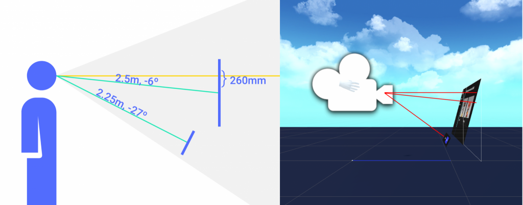
Position
It is also suggested that the UI center is put 6 degree lower compare to the eyesight as it is more comfortable for users to look at. The action bar is put around 27 degree lower and pointed towards the users.
Font
Things appear in VR much blurrier than that on 2D screens, so light and fonts with strokes should be avoided. VR better works with sans typefaces and with font weights from medium to bold. Minimum readable font size should be 24px from the distance of 1 meter and line heights also should be wider.
Color
Oculus used dark theme by default, so it’s recommended that the app’s design system also uses dark theme to match the system. Colors in VR appear to be brighter than normal 2D screens, hence pure black (#000)/white (#FFF) and high contrast colors should be avoided. Google VR Stylesheet recommends using #EEEEEE for white surfaces and #212121 instead of pure black.
Building a Design System
I ended up building a design system in Figma for the VR application following the same components structure that I have done for 2D screens, but keeping in mind the guideline and measurement when building for VR.
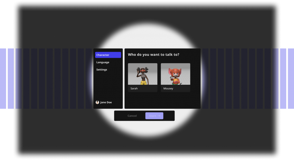
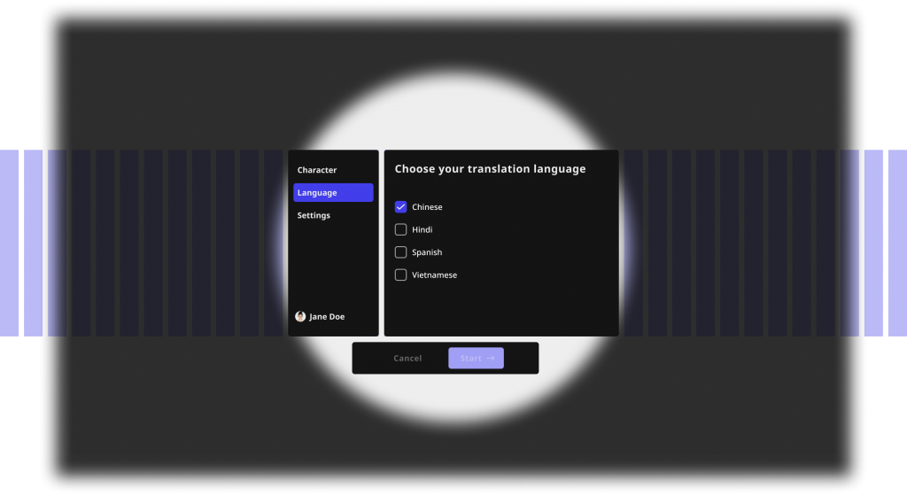
Once all the components have been tested in VR, I built my 2D menu screens in Figma, then exported fundamental assets of the components such as background, border radius rectangle, icons, images, etc. to build the components in Unity.
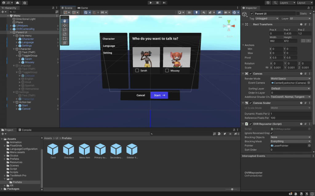
Step #2
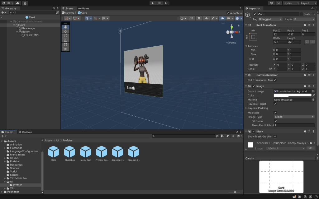
Unity setup
Transferring Figma design and components to Unity requires a learning curve. I used TextMeshPro to define typography styles, and Unity Prefabs to define design components. Each component in Figma is a Prefab in Unity following the same style settings and measurement in pixels.
The camera is placed 1.2 meters away and 6 degree higher from the menu to enhance user experience.